An app that helps visitors plan and get the most out of a zoo visit
UX DESIGN / UI DESIGN / UX RESEARCH
Overview
Still today, not many zoos have apps. Zoo visitors often struggle to find information on-site, relying on static maps or scattered information. This project explores how a mobile app could centralise planning, navigation, and animal information in one place. In my portfolio project for the Google UX Design course on Coursera, I decided to design an app for an imaginary zoo called Pantheon.
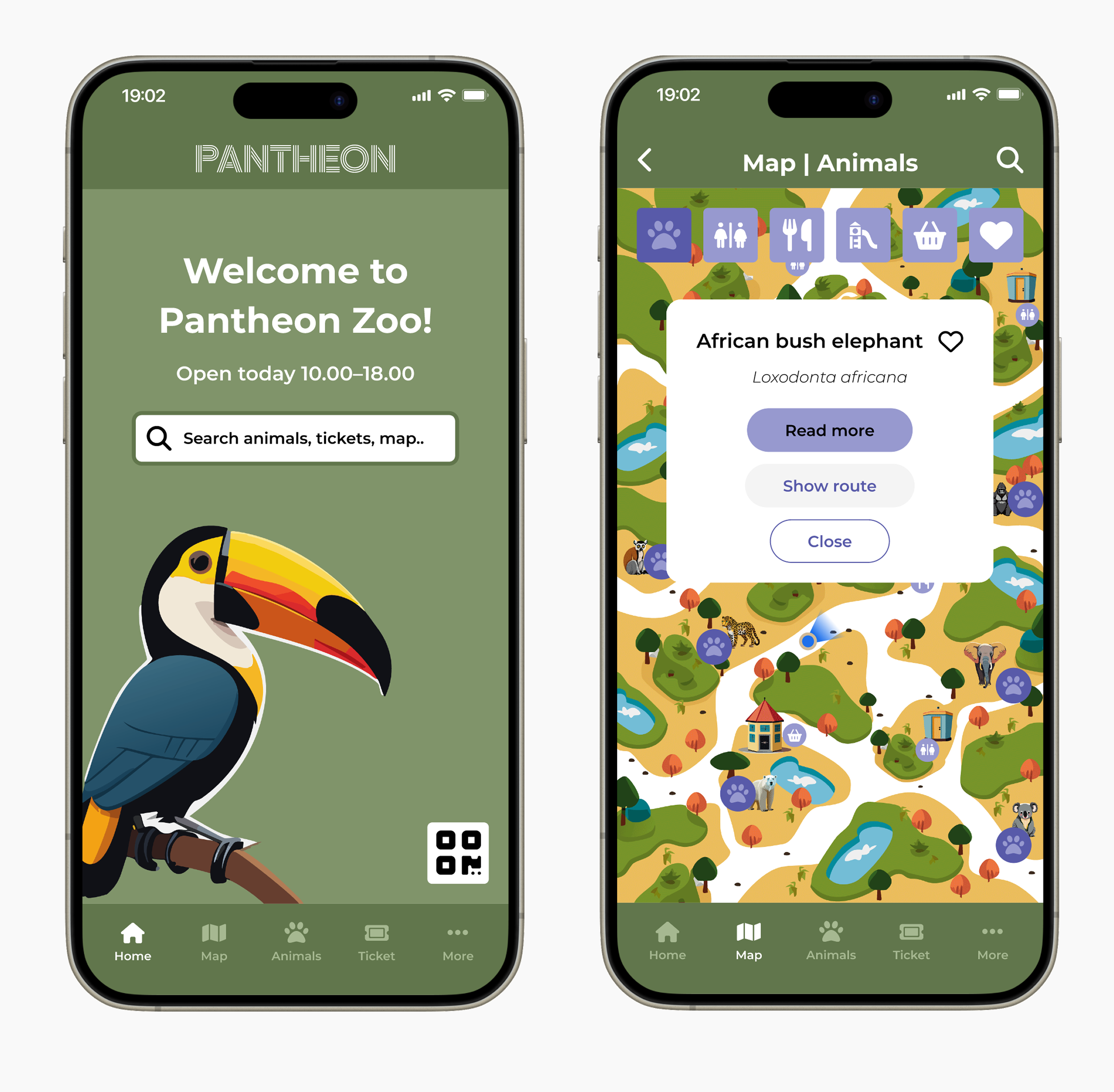
With the app, zoo visitors can plan their visit and find their way around the zoo easily. The app provides visitors with features, such as a map, a possibility for buying tickets, information about the animals and an agenda. The app could potentially be tailored for any zoo with its content.
Timeline: Winter – Spring 2024
Role: Sole UX designer (research, UI and UX writing)
Responsibilities: user research, wireframing, prototyping, testing, UX writing
Tools: Figma, Illustrator, Photoshop, Miro
Researching potential users and competitors
I started the design process by researching the app's potential users and competitors. By creating an empathy map and two user personas, I identified different user needs and pain points. The users want an easy way to buy a ticket to the zoo before going there, and they want to be able to find more information about the zoo’s animals.
Besides researching the users, I researched competitors by doing a competitive audit.
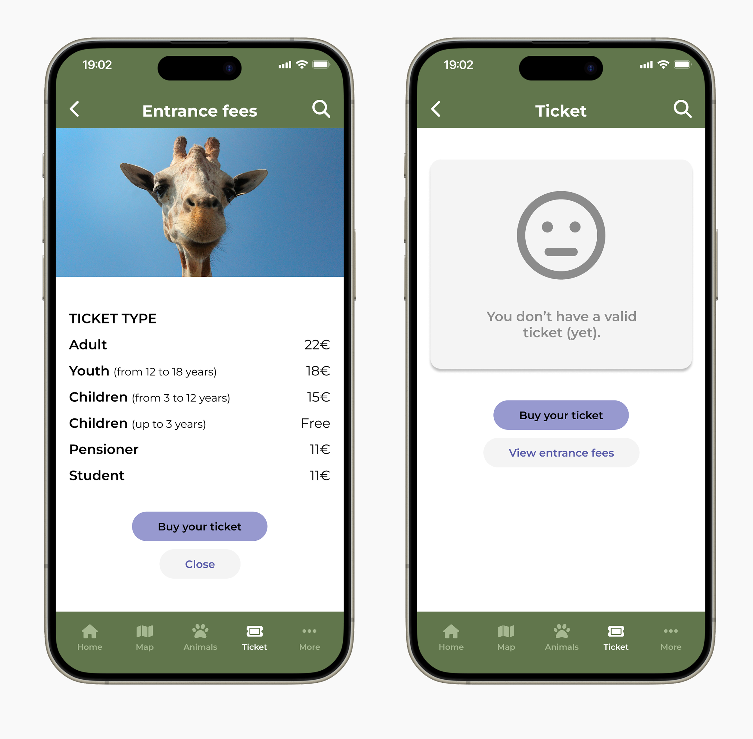
In the competitive audit, I analysed interaction, visual design and content on other zoos' or ticket-buying platforms' applications. Based on the competitive audit, I was able to discover gaps and opportunities that my app could solve. For example, not many of the competitors' apps had a built-in ticket-buying feature.
This insight led me to prioritise ticket purchasing as a core feature rather than an external link.
Brainstorming and crafting user flows
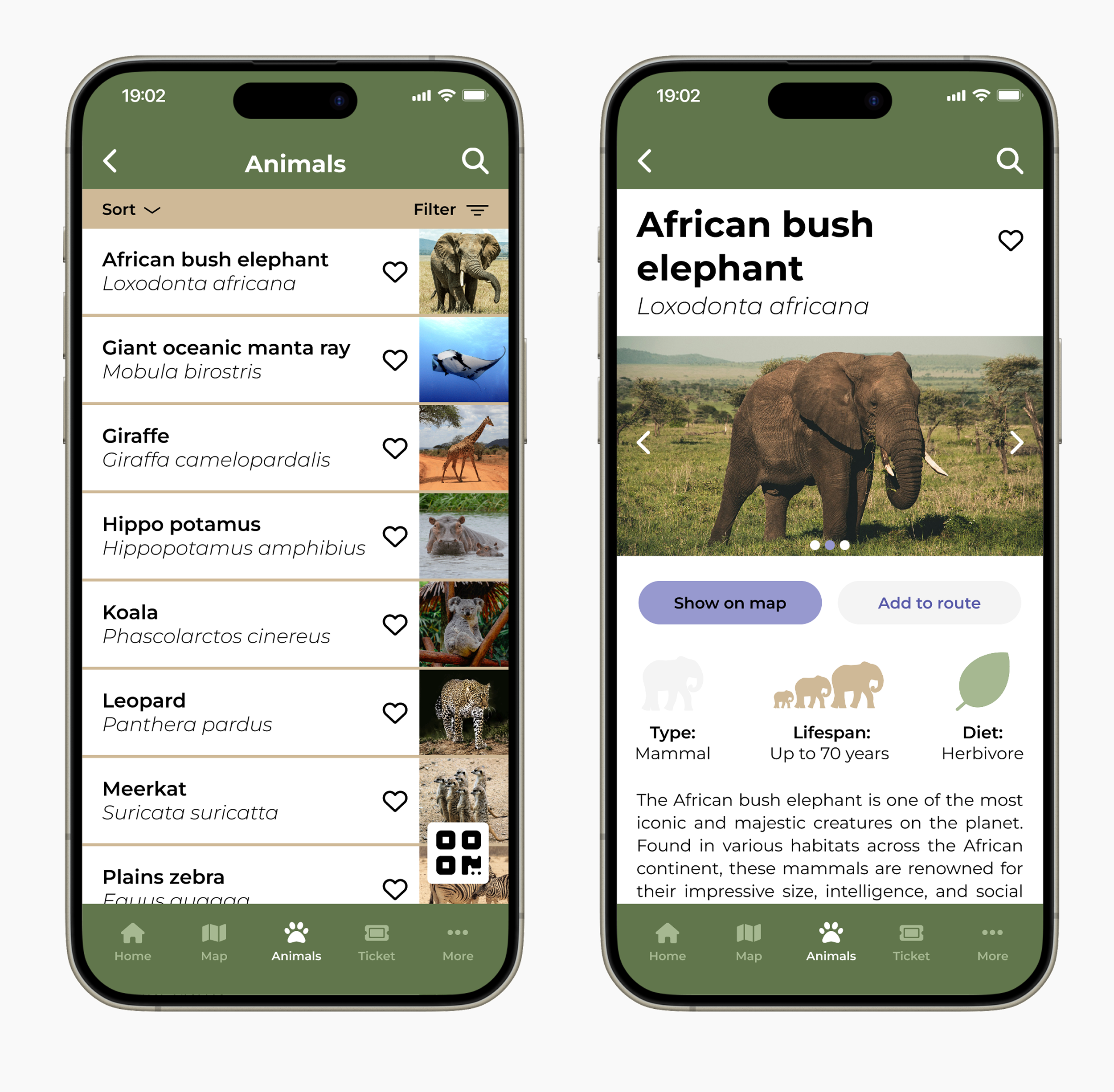
After doing research, I started to ideate the app by creating storyboards and making user flows to show the main paths that users are taking while using the app. I focused on two core tasks: learning about animals and buying tickets.
Sketching paper wireframes
Next, I created initial sketches for the app by sketching multiple alternatives on paper. This time, I focused on the main screens of the app that were needed for the user flows I had identified earlier.
From paper to digital wireframes
After sketching on the paper, I moved my sketches to Figma and started to create the digital wireframes. I first created the low-fidelity wireframes and gradually started to add more content and details to prepare the app for the first round of usability studies. Simultaneously, I made some changes to the wireframes; for example, I removed the search tool from some of the pages where I found it unnecessary.
Low-fidelity wireframes
Mid-fidelity wireframes
Usability studies and design iterations
I conducted two usability studies in total for my prototype. For both studies, I had five participants, male and female, with ages between 30 and 67 years. In the study, I asked the participants to perform three tasks: find out more information about a specific animal, search for a toilet in the zoo, and buy a ticket to the zoo.
Insights from the first usability study
Users struggled to complete the ticket purchase process due to unnecessary steps, leading me to simplify the flow and remove the account requirement.
Users had problems navigating the map due to unclear map symbols, so I decided to use a universal icon set
After conducting the first usability study, I refined my designs and created high-fidelity wireframes and a new prototype. Then I conducted the second round of usability study to find out if the problems identified in the first round were solved, if there were any new issues in the prototype and to find out what users liked about the app.
Iterations after the second usability study
In the second usability study, users found the map easy to use, but they wished it would provide more information already on the first view. For this reason, I replaced the dots with symbols matching the filter icons. It also came up in both usability studies that users would expect to see where they are on the map, so I added the user's location to the prototype.
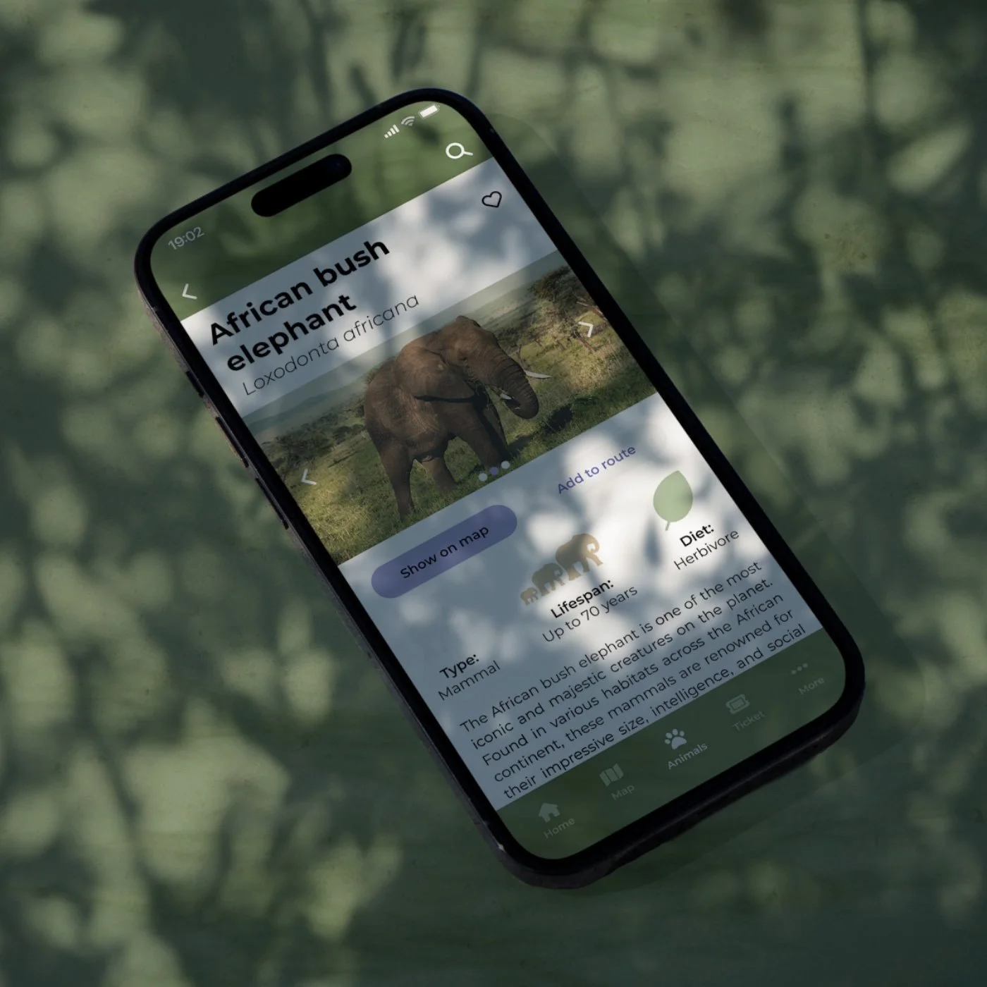
The usability study also revealed that some users found the threat level image unclear on the animal information page and didn't understand the meaning of the different colours. Adding tooltips and explanatory text improved clarity and reduced reliance on colour alone.
UI sticker sheet
Mockups
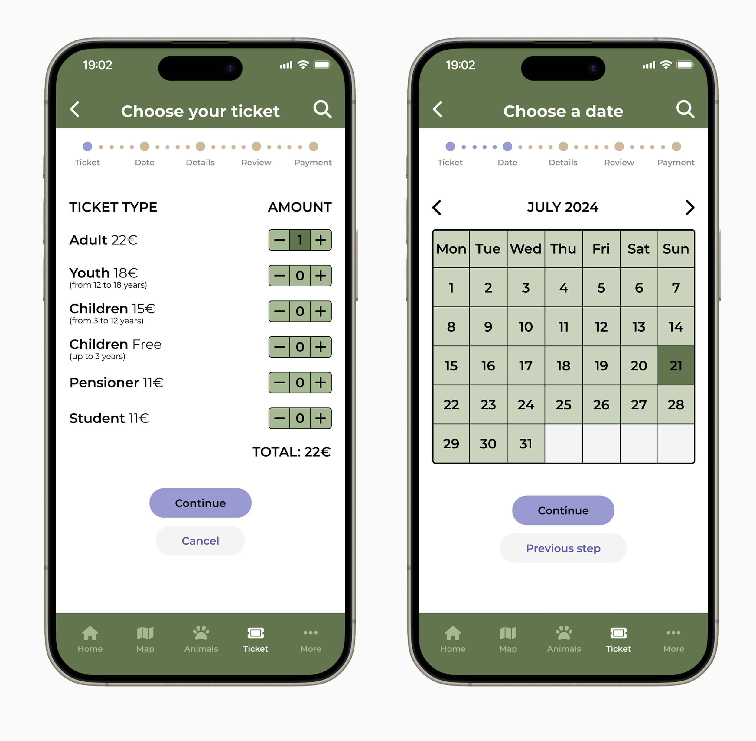


The app
Conclusion
This was my first UX design project, which I found in the beginning both intimidating and exciting. I'm very happy with the end result, and I learned a lot during the whole design process.
The biggest learning for me in this project was the importance of usability studies and multiple participants: every participant in the study had different considerations about the app and its features. This helped me to refine the prototype and make it user-friendly.
Next steps
Future iterations would focus on designing and testing route planning and scheduling features to understand how visitors plan their time inside the zoo.
Also, a dark mode could be designed for the app.