Designing a responsive multi-category rental website
UX DESIGN / UI DESIGN / UX RESEARCH
Overview
People who rent infrequently used items often need to use multiple service providers and struggle with complicated user interfaces and unclear pricing. This project explores how a responsive rental platform could simplify discovery, the rental process and checkout across devices.
Rent Easy's responsive website is designed for desktop and mobile devices. Its simple and modern design makes renting easy and fast, and rented items are conveniently delivered to people's doors.
This project was part of the Google UX Design course on Coursera.
Timeline: Summer 2024
Role: UX designer, UX researcher, UI designer, UX writer
Responsibilities: user research, wireframing, prototyping, UX writing
Tools: Figma, Photoshop, Procreate
Laying the foundation: user research
To begin with the design process, I wanted to identify different user needs and pain points that a rental website's users can have. In the beginning, I created an empathy map and two user personas. The users want to be able to rent items that they use rarely in an easy and affordable way. These items could be, for example, renovation tools, games, camping gear or party decorations.
Research on the current market
Next, I did a competitive audit to see what kind of services there are and to see how rental companies' websites function and what they look like.
I found out that there are a few peer-to-peer rental platforms where people can rent their own items and some rental companies that have specialised in specific items, for example, hiking and camping gear or renovation tools. However, there are not many companies that would rent various items.
By doing a competitive audit, I was able to discover gaps and opportunities that my website could consider. These were, for example, clarity in navigation and layout, a fresh and modern design, a good search tool and filtering options.
Crafting the user flow and storyboards
After the research, I defined the typical user flow for the website, where the user wants to rent an item, which in this case is a board game.
I also created big-picture and close-up storyboards for the user flow, which I had defined.
Visualising the structure of the website
Next, I created a sitemap for the website to outline all the pages that it would include. The sitemap helped to visualise the structure and content of the website.

Paper wireframes for multiple screen sizes
I crafted paper wireframes from the main pages of the website for three different screen sizes: desktop, mobile and tablet. I created multiple versions of all pages and screen sizes to find out how I would want to layout the website, and then created refined versions of each page.
Creating the low-fidelity prototype
Next, I created a low-fidelity prototype with pages that formed a complete user flow. As the website is meant to be responsive, I made two versions of the low-fidelity prototype: one for desktop and one for mobile.
Desktop prototypes
Mobile prototypes
Crafting the high-fidelity design
After my low-fidelity prototype was ready, I moved on to crafting the high-fidelity versions. First, I created a hi-fi version of the desktop site and then turned it into a version suited for mobile. When the designs were ready, I turned my mockups into high-fidelity prototypes.
Mockups for desktop
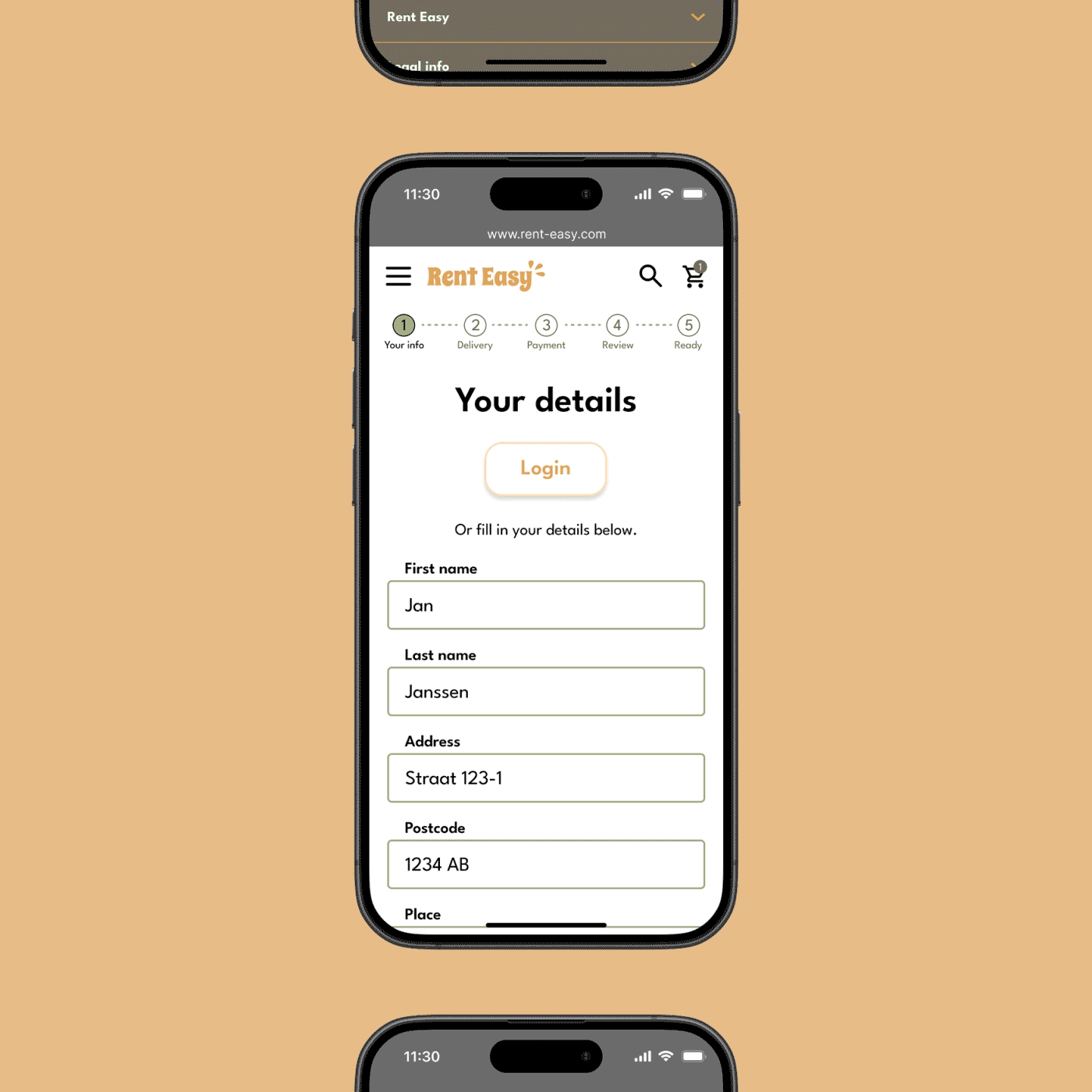
Mockups for mobile
UI sticker sheet
Accessibility considerations
Paired icons with text in the hamburger menu to make the navigation clearer.
Used hierarchy in headings to assist screen readers in understanding the structure of content and to make texts easier to read.
Considered the text colour and contrast to ensure good readability.
The responsive website
Conclusion
This was the first time I designed a responsive website, and I'm happy with the end result: a website that offers an easy and quick way to rent items on desktop and mobile devices.
The biggest challenge for me in this project was to create a clear and visually appealing layout. As the website's pages are quite content-heavy, I found it hard in the beginning to figure out how to get all the necessary information on the page while still creating a good user experience. I'm happy with the layout that I came up with, which makes the website clear, easy to use, and also looks good.
Next steps
There were no proper usability tests done for this website this time, so the next step would be conducting a usability test. The test would help to find out if the website needs improvements and if it's easy to use.
Also, additional features could be designed and added, such as the profile page and further category and product pages.