Mentoring platform for desktop and mobile
UX DESIGN / UI DESIGN / UX RESEARCH
Overview
Mentoring can help people advance in their careers and improve their skills. As my final portfolio project for the Google UX Design course, I decided to design a mentoring platform with a website and an app.
The platform is designed for people who are new graduates, will graduate soon or are making a career change. With the website and app, users can find mentors in their own fields or areas of interest, schedule meetings with them, and communicate with them via messaging or video calls. The platform also offers users valuable information regarding job hunting and skill development.
Timeline: Winter 2025
Role: UX designer, UX researcher, UI designer, UX writer
Responsibilities: user research, wireframing, prototyping, user testing, UX writing
Tools: Figma, Photoshop, Google Forms, ChatGPT
Starting with a survey
In order to begin the project, I conducted a survey about people's mentoring needs. There were 18 respondents to the survey, which mapped people's current career challenges, past mentoring experiences, mentorship preferences, and wishes regarding an online mentoring platform.
Survey results
Over 70% between 26 and 35 years of age
Over 70% career switchers
Less than 30% had a mentor before
Most respondents said they would like a mentor to provide guidance on their career paths and job-hunting, for example.
In-person meetings, one-on-one video calls, chat-based communication, and email exchanges were the most preferred mentoring formats. The main topics that people would like to discuss with a mentor are career advice, skill development, resume or portfolio review, interview preparation, and networking.
Most people would find mentor-mentee matching, chat integration, and a resource library, such as articles and templates, useful features in a mentoring app.
Emphatizing with the users
Based on the survey results, I created two user personas: one of a recent graduate and one of a career switcher. I also created user stories for both personas to highlight how my platform could help them with their needs.
I continued empathizing with the users by creating user journey maps, problem statements and goal statements. This helped me to figure out how my mentoring platform could help its potential users.
Researching competitors
After doing user research, I researched some possible competitors. For the competitive audit, I chose three mentoring platforms, a coaching platform and an AI-driven mentoring app.
The competitive audit helped me discover useful features for the website and app. Having good filtering options and categories on the mentor listing page, as well as reviews on the mentor page, and having an integrated video call tool were some of these.
Creating user flows and sitemap
To begin ideating the mentoring platform, I created storyboards and made user flows that show the two main paths users take while using the platform. I also created a sitemap to create a hierarchy for the platform and to map out all the pages it contains.
First wireframes on paper
After I had planned the structure of the platform, I started to sketch wireframes on paper. To design the main screens of the platform, I focused on the pages that were most important for the main user flows: the home page, mentor listing page, mentor and mentee profile pages, and scheduling.
First digital wireframes
After sketching some ideas on paper, I started to create low-fidelity digital wireframes in Figma.
Desktop website wireframes
Mobile website wireframes
Mobile app wireframes
First usability study and iterations
After completing the wireframes for two main user flows, I conducted the first usability study to test my prototypes.
In the first usability study, I had six participants who represented the user group. Study participants tested the platform's two main user flows: scheduling a meeting with a mentor and starting a video call with the mentor. I realized I had to tweak the scheduling flow and make some of the buttons more clear after reviewing the study results.
Study results
Scheduling tool needs to be easier to find
Booking confirmation should be added
Video call button should be more clear
Based on the feedback and in order to improve the user experience, I removed the 'Schedule' tab from the mentor profile page and added a 'Schedule' button instead, which opens an overlay with scheduling options on click. On the desktop version, the button is above the fold, and on the mobile version, the button is floating at the bottom of the screen.
Besides making the scheduling tool more clear, I added a booking confirmation message and changed some of the buttons' visual style.
High-fidelity prototype
After the first usability study, I started creating the high-fidelity prototype. I decided on the colour palette and style for the visual elements. To make the design more coherent, I created UI components while working on my prototype. I also made some alterations to the layout, as I wanted to include more white space in my design.
Desktop website wireframes
Mobile website wireframes
Mobile app wireframes
Second usability study and iterations
I conducted the project's second usability study after finishing the high-fidelity prototype. The second usability study involved seven people from the platform's user group. The participants tested the same two primary user flows as in the first usability study: scheduling a meeting with a mentor and starting a video call with the mentor.
According to the second usability study, both the website and the app were easy to use, and all participants completed both tasks without difficulty. Feedback from the study was positive, and based on the results, I needed to make only a few minor changes.
Study results
App bottom menu needs to have better contrast
Interaction after ending a call needs to be changed
Booking confirmation should have a link to the scheduled meetings
I changed the icon colours to enhance the contrast in the app's bottom navigation. Additionally, I increased the size of the font. On the booking confirmation screen of the mobile website and app, I added a link to the scheduled meetings.
After ending the video call, some participants were confused that they were taken to the mentor's and mentee's conversation screen instead of the screen where they started the video call. That's why I changed this interaction to take the user back to the previous screen, where the call had started.
UI sticker sheet
Using AI to boost productivity
I used AI tools to enhance the productivity and efficiency of my work in this project. Besides using AI tools for content creation and concept brainstorming, I also used ChatGPT when I encountered problems with Figma in the prototyping phase. With AI assistance, I was able to swiftly address issues and maintain a steady workflow, leading to quicker iterations and a more polished final product.
Besides ChatGPT, I used thispersonnotexist.org to create imaginary people's profile images for the platform.
Mockups
Mockups for desktop website
Mockups for mobile website
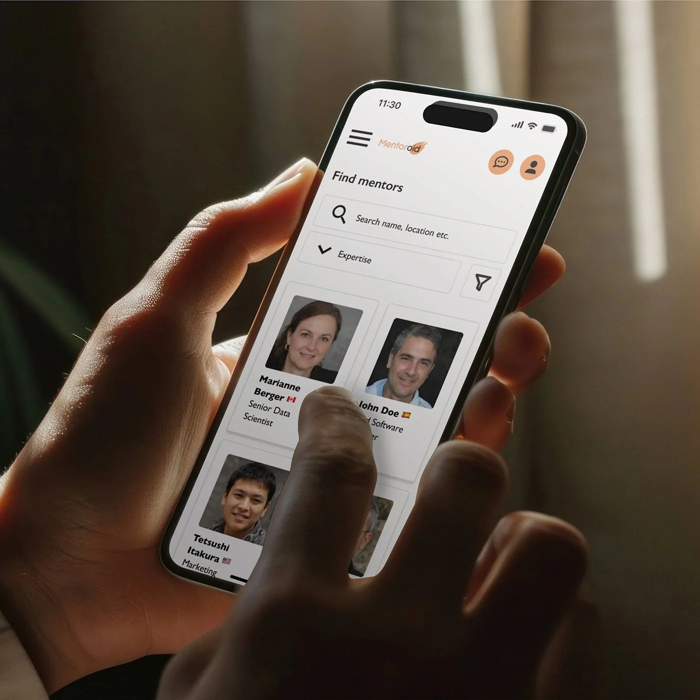
Mockups for mobile app
The mentoring platform
Conclusion
The biggest challenges in this project were figuring out how to integrate the scheduling tool on the platform, coming up with a nice mobile layout, and finding a good structure for the mentee dashboard. There was a lot of information, icons, and buttons that fit nicely on the desktop version, but on the mobile site, the layout started to look crowded. Nevertheless, I'm happy with the outcome. The mentoring platform has a consistent, clean and fresh look across desktop and mobile devices.
During the project, I also learned that in this case, it would have been better to design the app before the mobile website. I decided to redesign the app's UI, as my initial plan for the layout didn't work that well on mobile. After the redesign, it was easier to implement the same layout for the mobile website.
Next steps
For this project, I only designed the main user flows of the mentoring platform. To complete the platform, the last pages should be designed. These include, for example, the material library section, log-in, FAQ and mentoring info pages.